#67/111: Designing the Obvious

What is it about?

What makes a product more usable? Robert Hoekman, jr. shows you how to increase the usability of your web & mobile application and why hover divs aren’t better than pop ups.

What can I learn?

Less is more: I just want to show you this post of milof:

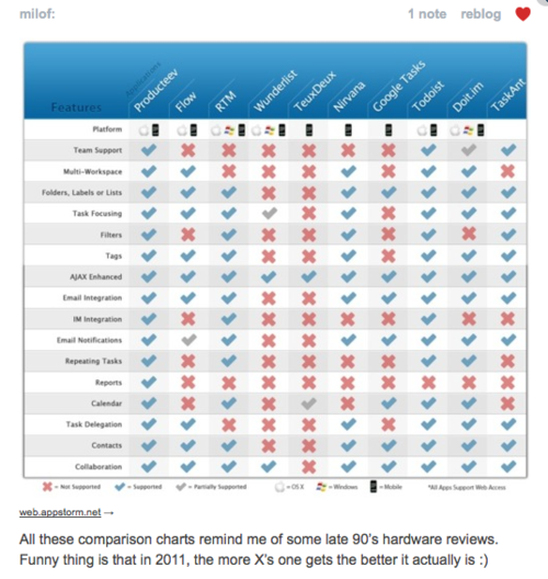
Be forgiving: You often got a pop up asking if you want really delete this message. However, a better way is to allow your user to redo this action. Implement a undo feature into your application. This will maintain the user’s work flow. If you can’t do this because there is a required steps, like entering a valid email address, help your user to do it properly, e.g. use inline validation and some nice Javascript.

Don’t be a jerk: This is probably the conclusion of this book. Your users shouldn’t have to learn how to use your product. The more things your user can do intuitively, the better it is. If they have to learn new things make it easier. Produce videos or screen casts or even some screen shots but don’t just give them 200 pages of plain text.

Conclusion

Designing the Obvious is like Don’t Make Me Think 2.0. Robert Hoekman, jr. also shows how real products could be improved and got a similar causal style. There are some great ideas for better usability. I especially liked the undo function for web applications. Great book, read it for yourself! Recommendation.

#50/111: Don’t Make Me Think

What is it about?

Steve Krug writes about Web Usability, i.e. how can you make it easier for your audience to use your website/web application. He shows how to conduct simple usability tests, how to fix major problems and how people actually use websites.

Key points?

Create self-explanatory websites: Most people don’t read, they scan and try to muddle through your site. Your first goal should be to design your site so that most people can use it intuitively and safely.

Use visual hierarchy: A simple example is a blog post. There is a headline, which is big, some sub headlines, which stands out of the normal text and of course the normal text. This allows your readers to recognize which information is more important.

Conduct simple usability tests: You don’t have to invest $50k to do usability testing. Steve Krug recommends to start with about three people every month. It’s important to record every session, you can use tools like Camtasia for this. But what should you test? Give people assignments to do something, e.g. add a new customer and let them muddle through. You could also ask them what they want to do and why.

Conclusion

Don’t Make Me Think uses his own recommendations which is pretty great. Steve Krug uses lots of examples and shows how real websites could be improved. The book is pretty basic. However, you will receive the most insights from testing your product. Nice book!