In the first chapter of Passionate Programmer Chad Fowler talks about the supply of programmers for new technologies and really old ones and wage premiums.
Data
I’ll consider programming language instead of general technology because its too diverse. My first thought was to look at TOIBE which publish a programming language popularity index every month. However, that doesn’t necessary reflect the market demand. So, I looked for other sources and found this blog post which used the indeed jobtrend tool. This gives us a nice idea of trends.
Jan 05 - Nov 11, Jan 09 - Nov 11

Java: +28%, +5%
C: +23%, +1%
C++: -15%, -18%,
C#: +120%, +24%
PHP: +325%, +140%
Objective-C: +11,000%, +8400%
Visual Basic: -8%, +24%
Python: +610%, +330%
Javascript: +160%, +95%
Perl: +20%, +10%
Ruby: +2,300%, +1,300%
SQL: +30%, +5%
Pascal: -26%, -3%
Lua: +20,000%, +10,000%
Ada: +22%, +16%
Cobol: -45%, -17%
Fortran: -27%, -51%
Erlang: +4,500%, +2,500%
Prolog: -27%, -49%
Haskell: +300%, +225%
F#: +3,250%, +3,250%
Groovy: +4,200%, +3,250%
Scala: +5,500%, +5,500%
Ada: +25%, +17%
CoffeeScript: +2,750%, +2,750%
Clojure: +12,000%, +12,000%
Lisp: +23%, -5%
Delphi: -5%, +7%
ABAP: +15%, +0%
Graphs / Interpretation
Long term and short term growth
I imported the data into Stata, log transformed ( ) it for readability and plotted it with long (6 years) and short (2 years) term growth. Here you can see the whole graph which is quite unreadable beyond C#.

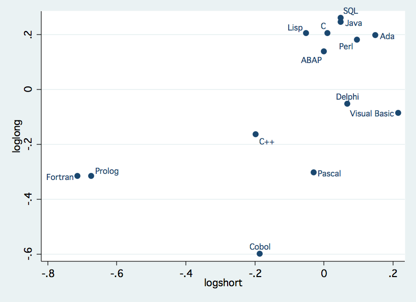
Therefore I split it up into two charts. The first chart contains all languages with less than 100% growth in the last 6 years, i.e. about 12% annual growth on average. This threshold is arbitrary but helps to split the data, so that it is more readable.
For the interpretation: I.e. Cobol is at -0.6 on loglong, i.e. long term growth. And zero percentage growth means a log value of 0.
We see the expected candidates here, Fortran and Cobol. Ada is quite high which was surprising, at least for me.
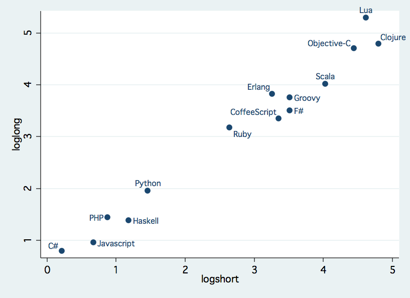
Here’s the other half ot the chart:
Some great newcomers are Clojure, CoffeeScript and Scala. PHP is still strong which surprised me, too.
However, it’s important to consider that e.g. that the demand of Clojure developers increased dramatically but it’s still a niche language.
Salary and growth
At the next step, I took the average salary from indeed for each language and normalized it (). If we plot this normalized average salary and the log transformed short term growth we get this graph:
Interpretation: avgsalary indicated the percentage of higher/lower salary to the average (~$88,367) in std. dev (about $12,308). For example ABAP got a avgsalary of about 2, therefore the actual salary is
Also I added a linear regression line which slope is actually significant. ( and std. err. of
The data is quite fuzzy so don’t get overly excited. For example the data for ABAP is quite skewed because this also includes e.g. consultants. However, we can see a general trend for higher wages for trendier languages which is to be expected.
If we exclude our outliners, i.e. ABAP, Ada and Visual Basic, we get other data.
Average salary increases to $89,720 and its std. dev. decreases to $8,369 (about a third!). Our estimate gets a lot better ( and std dev.
). And our graph looks a bit different:
We can see even see some kind of clustering. One with languages with logshort > 3 and then there’s this Java, C++, C# cluster. Quite interesting!


