Visualize This


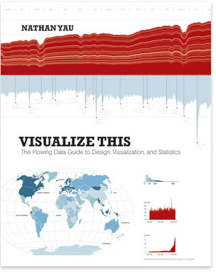
This book was sitting on my shelves for nearly two months and I finally read it. It’s written by Nathan Yau, the guy behind FlowingData.

Visualize this starts of with a intro into one of my favorites topics, i.e. data collecting and cleaning. Yau uses Python, which is a great choice for such tasks. Chapter after chapter he introduces new tools (e.g., Illustrator, R, Google Maps) and shows how to get started with them. I think that pretty much resembles the book. It’s about how to get started in data visualization and its tools.

One critique is that the target group isn’t clear, is it for programmers or graphic designers or statisticians? It’s got a bit for everybody but no thorough path through the book. The examples are quite good and I love it that he shows different steps of creating graphics. The paper and print quality is really good, which is really important for books about graphics and visualization.
All in all, I’m quite happy with this book. It shows how to start and is written by someone who is more connected to the open source/internet world than to academia or corporate one which it quite cool because you don’t have to invest in expensive software to try the examples out.

Intro to Data Science (UCB)

A hour ago someone posted on hacker news about this course at UC Berkeley.
You can find the slides and the videos from last year or slides only from this year. The material looks pretty basic but covers data preparation over two weeks which is quite rare but really important.
Coming from a university that basically ignored everything which wasn’t academic, two things stand out.
Firstly, there are guest lectures from people from Google, Optimizely, Yahoo, etc and their lectures are generally quite interesting.
Secondly, the freedom in choosing the final projects is awesome. You can choose freely some data sets which interests you and play with it. There was a wide variety of data from Youtube, Last.fm, basketball to Yelp.

Generally, I think that this is a pretty good intro course into this topic. Most universities try to over-theorize such basic courses and talk in my opinion too much about maths and too little about data gathering and EDA.

Also there was a particularly good comment in the hn thread:

Someone (can’t recall the source, sorry) recently defined “data scientist” as “a data analyst who lives in California.” —baconner

SOPA: Donations and Preferences

Data

I saw on Hacker News a neat website posted called (http://www.sopaopera.org/). The comments stated some hypothesis, e.g. that donations of entertainment and internet companies predict the support or opposition of the SOPA bill.
The data is directly from sopaopera.org which itself aggregates it from various sites.

Graphs & Tests

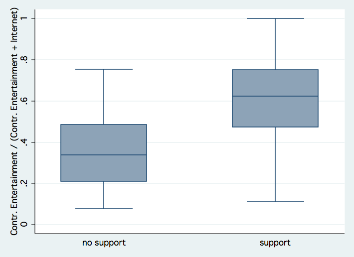
After cleaning the data and importing it into Stata. I looked through it and plotted this box plot which shows how much contributions each group got by entertainment companies in comparison to entertainment and internet company contributions.

In case you don’t know how to read such plot. The thin bars indicate min and max values and the blue box indicates how many people are between the first and third quantile, i.e. 25% to 75% of the population. The line in the blue box shows the median.

You can see that the median for the opposition is about 35% contribution ratio in contrast to the 65% contribution ratio of the supporters. Afterwards, I wanted to test if this difference is significant. In fact, it is highly significant (95%, t = -4.73).

Furthermore, here’s a plot of absolute contributions log-transformed:

The next step is to do a logistic regression to check the prediction quality of each attribute. I regressed with age, party (is_democrat), seniority and quota of entertainment contributions (quota_ent). You can see the results:

 ------------------------------------------------------------------------------
       support |      Coef.   Std. Err.      z    P>|z|     [95% Conf. Interval]  
  -------------+----------------------------------------------------------------
           age |   .0258551   .0358136     0.72   0.470    -.0443382    .0960485
   is_democrat |  -1.252883   .6243361    -2.01   0.045    -2.476559   -.0292067
     seniority |  -.0262688   .0381962    -0.69   0.492     -.101132    .0485943
     quota_ent |   5.839435   1.447732     4.03   0.000     3.001933    8.676938
         _cons |  -1.968467    2.01512    -0.98   0.329    -5.918029    1.981096
  ------------------------------------------------------------------------------

We can see that is_democrat and quota_ent are significant not zero whereby quota_ent is the most significant. This isn’t so much of a surprise.

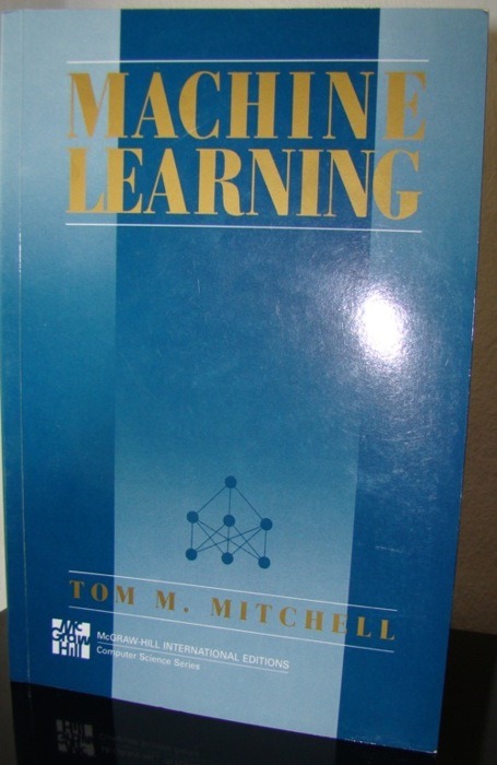
#85/111: Machine Learning

The book

This is probably one of the standard intro texts into machine learning. Tom Mitchell covers most of the basic techniques in machine learning (ToC) but doesn’t cover all of them, e.g. SVMs. I got a bit of background in statistics so it was rather easy to dive into machine learning although their terminology is a mostly different from statistics.

If you don’t have a background in statistics but solid basics in calculus then it should be rather easy to understand the contents of this book. There are lots of exercises which help you to strengthen your understanding. I think it’s an ideal theoretical basis for Programming Collective Intelligence. All in all, a really nice book if you are interested in machine learning.