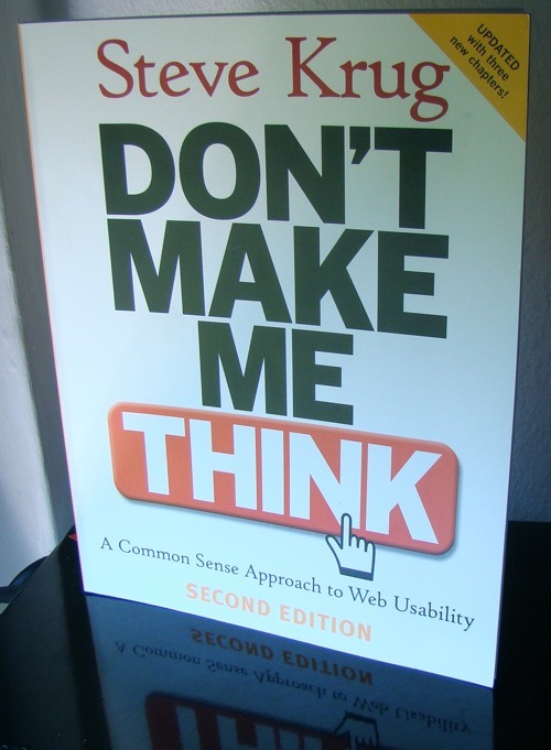
#50/111: Don’t Make Me Think

What is it about?

Steve Krug writes about Web Usability, i.e. how can you make it easier for your audience to use your website/web application. He shows how to conduct simple usability tests, how to fix major problems and how people actually use websites.

Key points?

Create self-explanatory websites: Most people don’t read, they scan and try to muddle through your site. Your first goal should be to design your site so that most people can use it intuitively and safely.

Use visual hierarchy: A simple example is a blog post. There is a headline, which is big, some sub headlines, which stands out of the normal text and of course the normal text. This allows your readers to recognize which information is more important.

Conduct simple usability tests: You don’t have to invest $50k to do usability testing. Steve Krug recommends to start with about three people every month. It’s important to record every session, you can use tools like Camtasia for this. But what should you test? Give people assignments to do something, e.g. add a new customer and let them muddle through. You could also ask them what they want to do and why.

Conclusion

Don’t Make Me Think uses his own recommendations which is pretty great. Steve Krug uses lots of examples and shows how real websites could be improved. The book is pretty basic. However, you will receive the most insights from testing your product. Nice book!

One man’s meat is another man’s poison. user interfaces.

GUI/UIs are important. It’s often crucial.
People use Kate instead of emacs or vim although vim and emacs are more powerful. But using emacs/vim is not that intuitive as using Kate.
There are many other comparisons. So, why do (open-source) developers neglect the UI?
From my point of view, making UIs is kind of boring. Mostly, it’s redundant, time-consuming and not decently abstracted.

Redundancy: Sometimes you’ve made a proper simple CLI. It works really fine but not for your users.

Time-consuming: Some clever frameworks generate parts of the UI for you. That’s pretty nice. Though, if you don’t have a suitable framework and your data isn’t modeled correctly you have to do it manually.

No decent abstraction: I think that’s a deciding point. Which UI is right? Which UI is wrong? If you are working on a DBMS you know which output is right or wrong. If SELECT user_id FROM user returns nothing although there are thousand entries, you know that is wrong. Its behavior is bad. But you don’t know if it’s bad if you put the calculate button on the left or on the right. There aren’t really metrics for UIs.

So, what can we do? Delegate the work. Look for someone who loves creating UIs. If you are working in a large (software) company there are probably UI-Designers. In open source projects UI-Designers are rare. Maybe because most open source projects don’t attract designers. Many websites are simple and pragmatic and designers aren’t attracted. It’s a vicious circle.

Time for intervention. Looking for someone on a flashy graphics board and maybe introducing him into the basics of a graphic framework.
They will love it because they are working on a great project and you will love it because you can concentrate on the code.

Update Here’s an article and some great comments about visual artists in open source: Pin Stack.